Monday, 7 May 2012
Friday, 4 May 2012
7. Looking back at your preliminary task, what do you feel you have learnt in the progression from it to the full product?
Looking back on my preliminary task I realise that I have learnt a lot about being precise with the target audience which I am targeting and the aspects which are most important to a magazine.
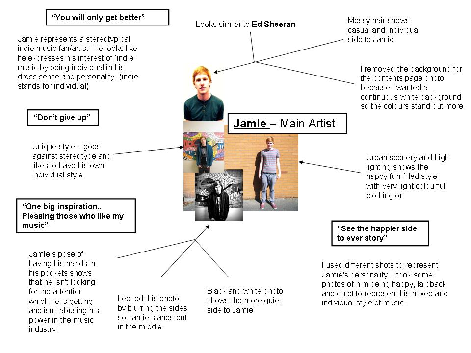
I believe that the main image is one of the most important parts of a front cover because that is what the customers see first, so it needs to be very appealing.
Looking at the two front covers which I have created, I have a medium shot for both images; the difference between the two images is the pose being carried out. I think having the model closer up makes the reader feel like they are interacting with the model and makes it feel personal. I don’t think that long shots should be used on front covers as they don’t stand out much on the cover.
The layout has improved a lot. With my preliminary task the layout is completely different, the sell lines are down the bottom of the page, and the subsidiary image is not the best of quality either. On my school magazine I think that the main image is good and effective as I left the perfect amount of room for the masthead and slogan. I think that my music magazine is a big improvement from my school magazine, the sell lines run down the side of the page, nowhere near the models face and fills out the page, whereas on my school magazine, because I put the sell lines down the bottom of the page, it left lots of room down the sides where there was no information.
I have learnt that it is best to use a variety of different camera shots and editing is very important when trying to ‘touch-up’ your image to make it look more effective and less boring.
The masthead is important as that is what people will use when talking about the magazine, so it is essential that is short-and-snappy, unique, and catchy and has to have a meaning to it. I think that I have improved the originality in my music magazine, whereas my school magazine was very ‘mainstream’.
I am now familiar with the software adobe in-design from creating my three different magazine pages and school magazine. I have learnt how to create the layout and style of a double page spread, how to split the pages into columns. I have gained experience compared to my school magazine cover. This is evident in the finished products layout in the music magazine.
I have learnt that a consistent colour scheme is important because it gives my magazine its image, then people start to associate those colours with my magazine, this will make the magazine instantly recognisable.
On my preliminary task I tried to keep the cover even at the bottom of the page with the sell line. I did this because I thought it would look tidier and make the main image stand out more on the page. As now I have realised that you can work around the main image rather than avoiding it.
I believe that my magazine pages look realistic as I have made up the codes and conventions of a real music magazine. I am happy with the outcome of how my magazine looks. I am especially pleased with the front cover and contents page. If I were to improve on my magazine then I would have a background different on the main article as I think that at some stages the text is difficult to read.


Wednesday, 2 May 2012

Double Page Spread - Completed Product

I have filled out the gap which was on the right hand side of the page with a review section on my double page spread, I have made sure that the color scheme is still the same of white/black/red. I think it looks effective.


Thursday, 26 April 2012
Contents Page analysis 2

I like this contents page. It consists of two A4 sheets. There are 9 images on this contents page. On the left-hand side of the contents page there is a large main image of a member of the 'GorrilaZ', as this picture takes up nearly the whole of the first page, it shows that it is trying to get the readers attention as a main article and shows that this particular artist has some importance in this edition of the magazine. Also there is an enlarged number for the big picture, this emphasises that the magazine is trying to grasp your attention towards page '44' to read their article. I think that the columns on the right and left of the double page spread could be easily recreated in my own magazine; this magazine also matches my colour scheme of red, black and white. I think the colour scheme works effectively in this magazine's contents page, so i will continue to stick with this colour scheme in my contents page.
Contents Page Analysis

I like this edition of a contents page by Kerrang magazine, ther music artists names which they are advertising and doing an article on is in bold, this is so they can catch the readers interest. I also like that the lines are splitting the imaged up into different collumns, this creates a nice structure to the contents page. This page is easy to navigate as each photo includes page numbers next to the image, this relates to the reader what is inside the magazibne. As most contents pages this includes a message from the editor, this maked the reader feel like the editor is talking directly at them. As most contents pages again they use a past or present magazine cover to show the reader what they are missing out on and what they can get 'tuned in' on. On the left hand side of this contents page the Bold subheadings are in capital letters which make the articles instantly eye-grasping. This layout could be fairly simple to recreate for my magazine as it is set out nicely in collumns and most of the photos in this contents page are not natural poses, they are pictures of bands/ solo artists performing.
Wednesday, 4 April 2012
Finished music magazine cover

I have slightly changed the size of text for the masthead, this is the finished product.. it may be slightly improved over the course of these next 2 weeks, but there will be no dramatic changes.
Tuesday, 3 April 2012
+(white+background+version).jpg)
+(black+and+white+version).jpg)
+002.jpg)
+001.jpg)


Monday, 2 April 2012
Album Cover

I have created an album color to fill out the right hand side of my double page spread and maybe to put onto my contents page, I have created it using paint and an editing software.
Saturday, 31 March 2012
edited contents page photo subsidiary article
.jpg)
I am going to use this photo which I taken at a concert on the contents page next to 'posters' im hoping it fits in with the theme well, I think the use of mobiles in the photo could make readers feel like they are interacting with the magazine.
edited contents page photo 2

I edited two photos for the contents page photos, I am going to remove the background of both this photo and the other one and place each of them into different drafts of the contents page and then compare which one looks better and more presentable.
edited contents page photo

I am planning on removing the background of this image and placing it on the left hand side of the contents page.
Friday, 30 March 2012
.jpg)


Thursday, 29 March 2012
Contents Page Header

This fits in well with my logo and is once again inspired by 'Q' magazine. I have included black on the header for this one as it draws the readers attention to the contents.
Subscribe to:
Comments (Atom)