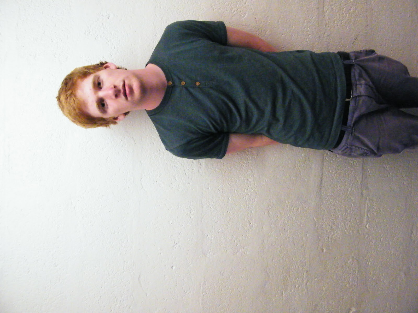
Jamie is one of the most popular artists which is rising to the top in 2012. He released his debut album over Christmas, ‘Progression.’ This album is said to have the potential to reach number one in both the U.K and the U.S charts. Jamie started his career performing in local pubs and as he started to get recognised for his talent, the amount of gigs he held rose.
who would of thought his childhood dream of having a number one could become reality as his debut album has sold millions and is still on the rise! His new hit single has a great backing natural acoustic guitar tune, and the lyrics used are clearly outstanding and meaningful throughout the song! Today we have interviewed him by asking him a few questions related to his new album, We also found out the TRUE meaning behind the lyrics of his hit new single, ‘Look at me now’.
Did you write your entire album on your own?
“Yeah, I did write the album alone, but I did have one big inspiration whilst writing every song, and that was pleasing those who like my music, helping them understand what I’ve been through. The song writing and sound is inspired by my personal life and mood relating to the lyrics.”
We hear that you record your own music in your own home, is this true?
“Yeah well I now have a studio in my home, that’s where the basis of my album comes from. I’d by myself then email my manager so he could give me other ideas to play with, sort of like a Postal Service method.”
Is there a story behind your Lyrics throughout your album ‘Progression’?
“Yeah, there is a personal story behind my lyrics, there are many routes it can take you. People can relate it to their own scenarios… But yeah, my personal story was from when I thought I had the girl of my dreams, until I realised that she was never there for me when I needed her most. So whilst singing, I was releasing my frustration of how damage can be done blindly behind closed doors without anyone knowing, people can be hurt without anyone knowing.
What is the story behind your new single ‘Look at me now’ ?
“In my new single, I make a happier side to the story of my album by emphasising that life isn’t all bad if things aren’t going your way, you may be hurt but there’s still some hope! Whilst creating this single, I was hoping others could relate this song to their own personal lives and see the happier side to every story!”
Do you plan on going on a WORLD tour anytime soon?
“Well, it’s always been a childhood dream to go on any kind of tour, let alone a world tour! Seeming I’ve just released my first album, It’s confirmed that I’ll be going on a rather small UK tour, mainly performing at the big arena’s like the CIA and the O2, but its always been a dream to perform at Wembley, hopefully in some recent years this could come true! But all tickets are on sale, and the tour starts 19th February at the O2 arena, don’t miss out on your tickets!”
We have also picked out the top 5 questions sent in from fans, which we have asked Jamie.
Jack - Can you see yourself maybe joining a band like ‘The Kooks’ or making a single with them?
“Hey jack, well I’m a massive fan of the kooks and I love the music they produce! So if they asked me if I was willing to make a single with them I would jump at the opportunity.”
Daisy - Seeming you’re single now, would you date me?
“Are you serious? Haha, I’m joking, I’m sorry but I am currently seeing someone so the answer is no, I couldn’t date you.”
Mitchell - I’ve learnt the guitar and my singing mentor thinks I have potential, where do I start?
“Seeming you’re finding it hard to get into a gig or anything, you could start off at local karaoke nights, but if you tweet me a video of you performing on youtube, then I will be more than happy to analyse you’re performance then maybe consider having you perform one song with the warm up acts at one of my gigs”
David - Is there really such thing as over-practicing before performing at a gig?
“I don’t think there is David, I get really nervous before gigs and tend to want to get everything perfect by practicing more. So I wouldn’t think that you can over-practice, because you will only get better.”
Georgina - When it comes to song writing I really struggle, is there any advice you could give for a beginner?
“Hey Georgina, when I started song writing I found that I wouldn’t like my own lyrics which I produced, but I would ask my friends/ family weather it sounds right and they usually supported me. I never started off by using my own ideas, I used to steal ideas and different backing tunes from different songs, but I would be more than happy to help if you tweeted me some of your ideas then I will maybe help you out with some lyrics and hopefully you can take it on from there. Don’t give up!”
.jpg)


.jpg)