ORIGINAL OWAIN
Age 18-28
'Original'? That doesn't mean anything does it?
It sure does to Owain though, sunshine.Owain is very, very fashionable, which means he avoids anything that would make him look as if he thought about being fashionable and following the crowd at all costs! His clothes are very basic and 'normal' which makes his sense of style so great and original.
Such as? Knitted sweatshirts, possibly slim fit jeans, vans trainers, short hair with tufty bits in it. Although his outfit will change the next morning, you can never predict what Owain is going to wear!
Listening to? Garage rock/post-punk revival acts which produce soft-rock like Kings of Leon or Arctic Monkeys.
Wants to be He'd call this a silly question and dismiss it as he wants to be individual, but would be very unlikely to refuse an offer to become a British-based honorary member of the Wu-Tang Clan.
Find Him In the renovated-warehouse 'cultural zone' of any British city by day, strolling through town expecting never to get noticed or sitting in your local bar by night.
Friday, 25 November 2011
Dress Code of Genre

Here is an example of how I want my model/models to be dressed. I want them to be dressed in a certain way which makes the reader instantly know that this is an 'Indie' magazine. The chequered-shirt, knitted jumper is a traditional indie outfit on the upper body. The majority of the indie artists/fanatics in the image above are all wearing slim jeans on their lower; this is a common part of an ‘indie’ outfit. I will now have to complete giving out my questionnaire's to determine how my main image will look like as I will have to relate my photo on what my target audience want e.g. colour schemes, band or solo artist etc.
Genre Chosen
I have done some research on the genre which I am going to base my magazine on. I have chosen 'Indie ' music. I am now thinking of what my models are going to wear on this fron cover and poses to make. I will be looking for albuin covers/photos of indie bands to see their outfits and general looks. So far from research I have done, I haver found that most Indie music bands and fans will wear clothes which are just normal which go against the mainstream outfits. So I was thinking of 'converse' or 'Vans' as footwear for the models and slim-fitting jeans or chino's which go against the mainstream colour of Sand/Mustard and Upper-body wearing knitted sweaters, graphic t-shirts or checkered lumberjack shirts with all buttons open. The poses which I am thinking to have on my music magazine cover is a long-shot of my model taking part in more of a 'natural' shot where their hands will be down by their sides. I will be posting some examples up soon.
Wednesday, 23 November 2011
Analysis of magazine covers I like

The masthead for this music magazine is placed behind the band which are in the photo, this is a great effect added to this front cover due to making the band stand out even more to the readers. The main image is a long-3-shot of the band members from ‘MUSE’ this is very effective as it shows all of the band members giving nothing away from their facial expressions showing they are serious about their music which is eye-grabbing. There is only one subsidiary image which also once again is advertising their own magazine and giving the reader an option, if they do not like the band muse, they are showing that there is also a U2 main article as well as ‘MUSE’. The sell lines on this magazine are clear and visible to the readers which are most important. The font chosen for the sale lines seem very effective so they stand out on the magazine for readers to see. I do like the design and layout of this cover because everything on there is clearly visible and not over-lapping one-another, I also do like the background image as it goes well with the bands look. The target audience of this magazine cover are people which are fans of ‘Indie’ music and big fans of ‘MUSE’ or/and ‘U2’. There are many pull quotes on the front cover of this magazine such as the main story, on this magazine the main story is based on ‘MUSE’ and the quote that they’ve used on this magazine is ‘We will be the first band in space’ this pull quote gets the reader thinking about what this story is about. Another pull quote which has been put onto the front cover of this magazine is the oversized ‘50’ for ‘acts you must see at Glastonbury
Analysis of magazine covers I like

I like the design put into this magazine, firstly starting with the masthead behind the band which are in the photo, this is a great effect added to this front cover due to making the band stand out even more to the readers. The main image is a long 5-shot which is very effective as it shows all of the band members ‘bonding’ and smiling as if they are a solid group which is ‘back for good’ and getting along with each other. There are no subsidiary images on this front cover as they want the reader to focus on the main story. The sell lines on this magazine are clear and visible to the readers which are most important. The font chosen for the sale lines seem very effective so they stand out on the magazine for readers to see. I do like the design and layout of this cover because everything on there is clearly visible and not over-lapping one-another. The target audience of this magazine cover are people which are fans of ‘Indie’ music and big fans of ‘Take That’. There are many pull quotes on the front cover of this magazine such as the main story, ‘TAKE THAT’ which then is followed by a big pull line ‘Back for good?’ this quote is a very effective pull quote due to one of their past singles being called ‘Back for Good’ which was sang before they broke-up, and they have used this quote to make the reader think about weather the group will actually stay together this time, and also bring back memories of their old song. The colour scheme on this magazine cover is very effective, the white background of the magazine makes the main image even more effective, and the red and gold themed sale lines is also very effective as they stand out very well and clear to catch the readers eye.
Tuesday, 22 November 2011
Music Magazine Questionnaire
- What age group are you in?
- 11-15
- 16-18
- 19-22
- 23-26
- 27+
2.which indie music artist do you prefer?
- The Killers
- Coldplay
- Arctic Monkeys
- Snow Patrol
- Ed Sheeran
3.which gender are you?
- Female
- Male
4.Which of the following stories would you be more interested in reading in my main story? (Pick four)
- Artists now
- Music competition
- Latest albums and CDs
- Upcoming artists
- Concert reviews
- Bands personal lives
- Other (please state)
5.What masthead do you like the best?
- Soundbox
- Amplitude
- Uprising
- INDIEpendent
- Overdose
- INDIEvidual
- Overdrive
- Other (please state)
6.Which slogan to you prefer out of the following:
- Feel the beat
- Let the lyrics take you away
- Let hallucinations become reality
- Just press play
- Addicted to music
- Hooked to the chord
- Other (please state)
7.What colours should the magazine cover be (choose three)
- White
- Black
- Red
- Blue
- Pink
- Purple
- Green
- Sepia
- Brown
- Other (please state)
8.Would you by a music magazine?
- Yes
- No(please state why)
9.How much would you be willing to pay to buy a music magazine?
- £1-1.50
- £2-2.50
- £3-3.50
10.What would you like to see as the main image on the front cover?
- Band
- Solo Artist
- Instruments
- Other (please state)
Monday, 21 November 2011
What you need to think about to create an effective main image for the music magazine.
Here is a list of things which I believe are essential to create a successful main image for my music magazine front cover:
- Get the lightning correct
- Size of image
- How many people will be in the photo
- Position where models will stand
- Background
- Location
- Props
- Composition
- Camera angle
- Shot distance
- Time of shoot
- Colour scheme
- Hair
- Make up
- Genre of magazine
- Representation - gender,age, style etc
- Setting, interior or exterior
- costumes are more important than props
- At least five photos
Starting points
I must think about the following aspects of my music magazine before you start planning your magazine the two main ones are …..
· Genre of music
· Target audience
But i must also think about…..
· Analysing real music magazines focus on cover, contents page and articles about bands.
· Create an imaginary band or music artist for the magazine cover, story and double page spread.
· Create a questionnaire to carry out market research into your target audience.
· Analyse images, bands and music artists in a range of music magazines. Identifying a particular style that you could use for your own magazine.
· Read a range of articles in arrange of music magazines. Try to find a layout and style that you could use for my own magazine.
Friday, 11 November 2011
School Magazine Cover Evaluation
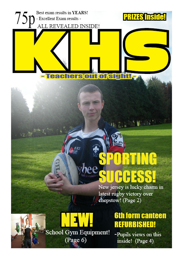
I believe on the whole, my school magazine front cover has turned out to be very successful. I was pleased with my main image on the front cover of a fellow 6th form student playing rugby. I was also pleased with my colour scheme of gold and black text because those are the colours that represent King Henry VIII school. Another thing I was very pleased with was the layout of my front cover. I chosen a different layout to what I had in my draft for the magazine, and I think taking the risk has paid off seeming it looks presentable. If I had more time on my magazine cover I would have added more photos to the sale-lines, I would have also took away the page numbers on my magazine cover, as it does not look as proffesional with them on. If I was to do my magazine cover again I would use a different masthead because 'KHS' is very original and could easily be imporved upon.


Subscribe to:
Comments (Atom)